Make your website look good on phones
See your website the way it looks on a phone or tablet, and fix what doesn't fit, without changing the computer version.
Most visitors open your website on a phone. Wobbio websites adjust to the screen by themselves, but it is worth checking every page before you publish.
See your website on a phone
At the top of the editor, select Mobile. The preview becomes as narrow as a phone. Use Tablet for a tablet, and Desktop to go back.
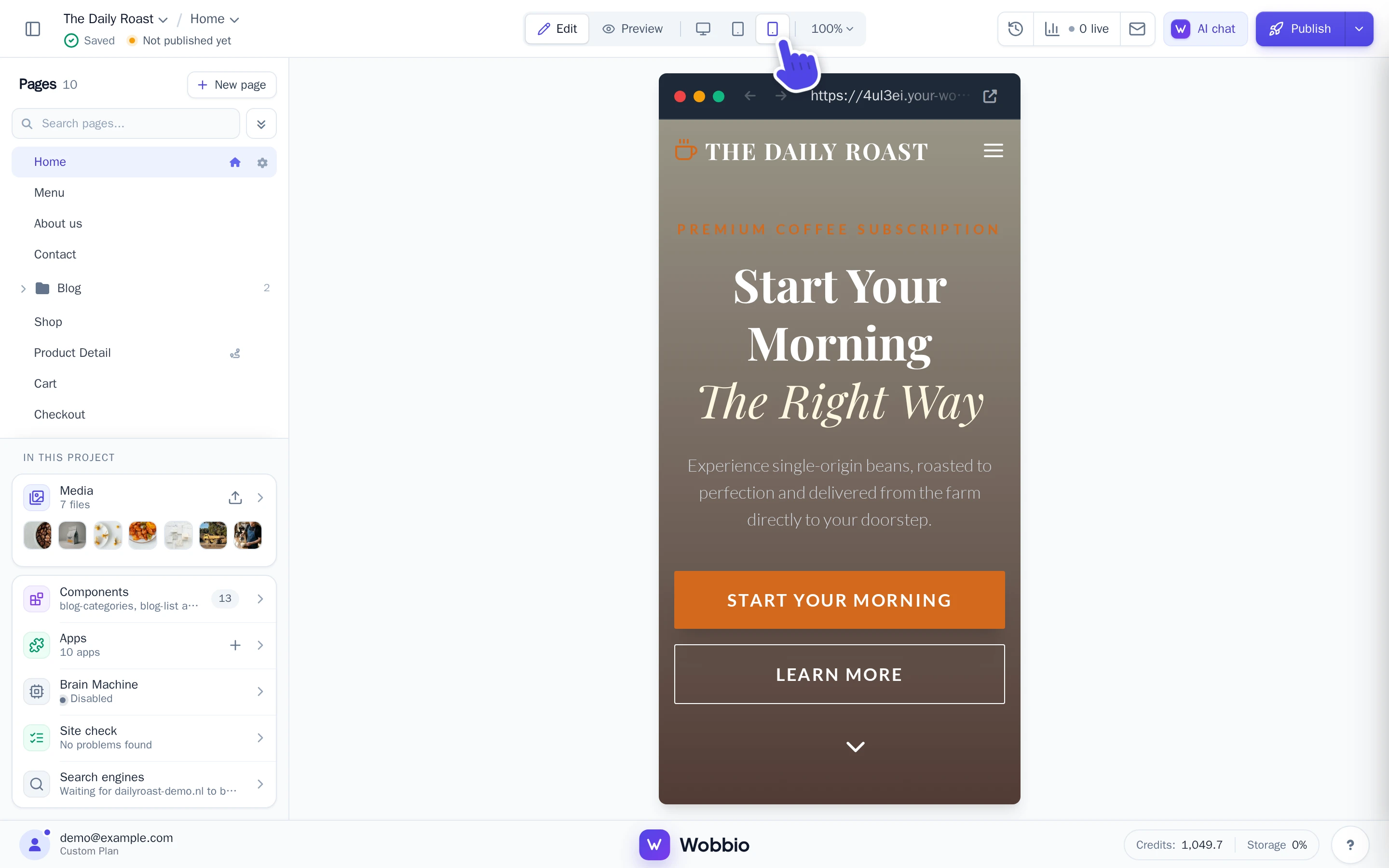
Scroll through each page, and look out for:
- text that is too small to read, or a heading that breaks in odd places;
- parts that are wider than the screen, so the page moves sideways;
- buttons that are too small to tap, or too close together;
- a menu whose items run into each other;
- photos that are cut off in the wrong place.
Fix what doesn't fit
-
Keep the Mobile view on.
-
Select the part that doesn't fit, if there is one.
-
Ask the AI chat what should change on phones, and say that the computer version must stay the same. For example:
- “On phones, put the three blocks below each other.”
- “On phones, make this heading smaller so it fits on two lines.”
- “On phones, the menu items run into each other. Put the menu behind a menu button.”
- “Hide this photo on phones.”
-
When the AI is done, check the page on a phone, a tablet and a computer.
The AI can look at your page on a phone-sized screen to check its own work. Add “and check it on a phone” to your request to make sure it does. See Get the result you want from the AI for more tips.
Text and images you change yourself
A text or image you change yourself changes on phones and computers alike. To use a different text or photo only on phones, ask the AI.